7 SaaS Landing Page Patterns That Actually Convert in 2026
We've designed 30+ SaaS landing pages. These 7 patterns consistently drive the highest conversion rates — with real examples and why they work.
Hyflint Team
Design & Web
Why Most SaaS Landing Pages Don't Convert
The average SaaS landing page converts at 2–3%. The best ones hit 10–15%. The difference isn't design talent — it's structure.
Most SaaS pages make the same mistakes:
- Leading with features instead of outcomes
- No social proof above the fold
- CTAs that say "Learn More" instead of something specific
- No urgency or differentiation
- Mobile experience is an afterthought
Here are the 7 patterns we use to consistently beat industry averages.
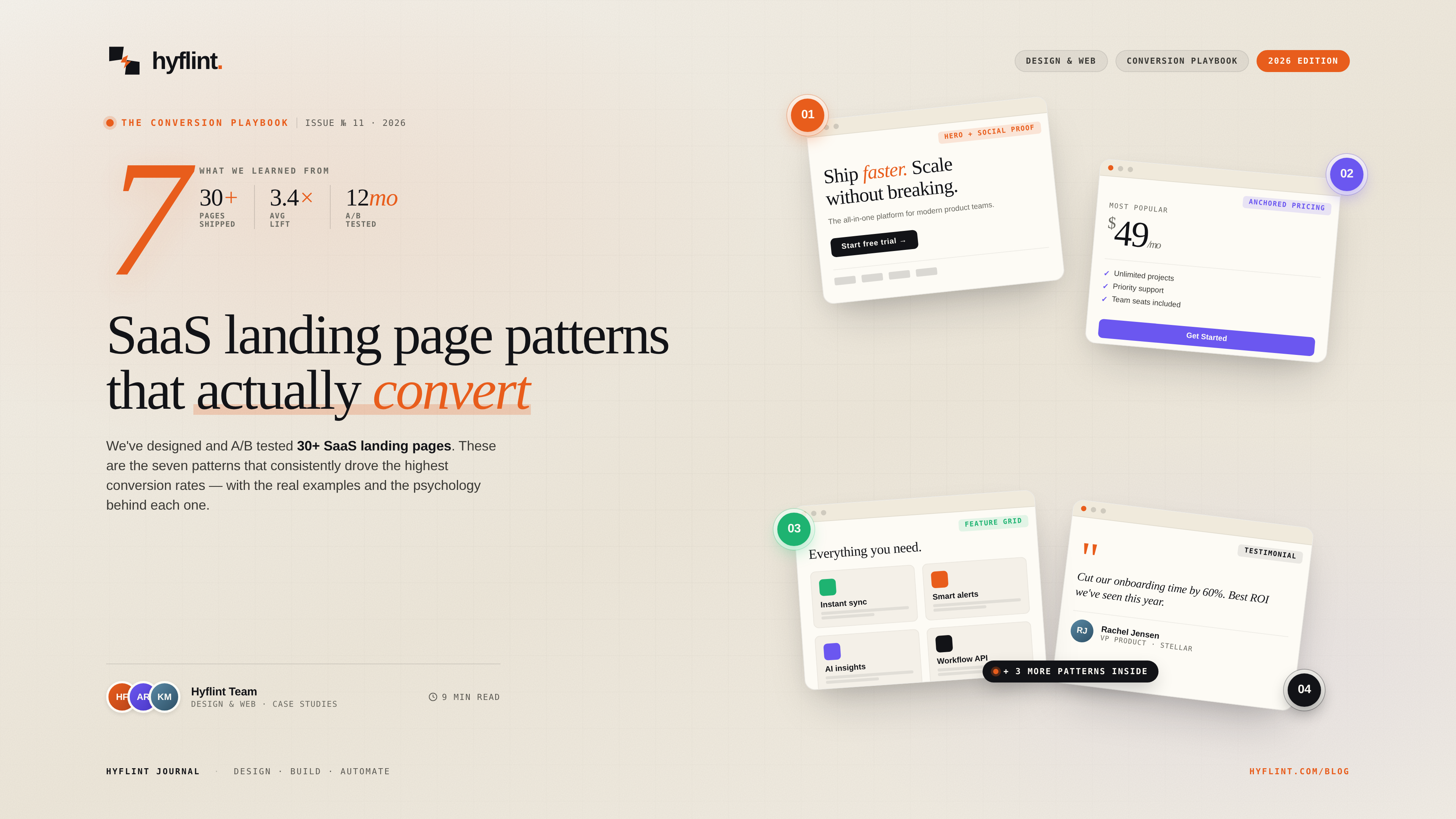
1. The Outcome-First Hero
Pattern: Lead with the result your product delivers, not what it does.
Bad: "AI-Powered Project Management"
Good: "Ship projects 40% faster with half the meetings"
The visitor doesn't care about your technology. They care about their problem. Put the outcome in the H1, the mechanism in the subheading.
2. The Logo Bar + Specificity
Pattern: Client logos immediately below the hero, with a specific claim.
Bad: "Trusted by leading companies" + logos
Good: "2,400 teams shipped faster last quarter" + logos
The number makes it credible. "Leading companies" is meaningless. "2,400 teams" is falsifiable — which makes it believable.
3. The Problem Agitation Section
Pattern: Before showing your solution, spend 2–3 sentences describing the problem so precisely that the visitor thinks "they get it."
This is the most underused pattern in SaaS landing pages. Most pages jump straight to features. But conversion happens when the visitor feels understood, not when they understand your product.
4. The Three-Column Value Props
Pattern: Three cards, each with an icon, a benefit-focused title, and 2 sentences of supporting copy.
Why three? It's the maximum a visitor can process at a glance. Four feels like a wall. Two feels incomplete. Three creates a natural rhythm: problem → solution → outcome.
5. The Interactive Demo
Pattern: An embedded product screenshot or video that the visitor can interact with — even if it's just a GIF or a clickable prototype.
Static screenshots are fine. But a 15-second product demo GIF increases time-on-page by 2–3x. And time-on-page correlates directly with conversion.
6. The Social Proof Stack
Pattern: Layer multiple types of social proof throughout the page:
- Logos (authority)
- Testimonial quotes (trust)
- Specific metrics ("saved 30 hours/week")
- Review badges (Capterra, G2)
One type isn't enough. Stack them. Each type answers a different objection.
7. The Sticky CTA
Pattern: A persistent CTA bar that appears as the visitor scrolls past the hero section.
Not a popup. Not a modal. A subtle, fixed bar at the top or bottom that says "Start free trial" and stays visible throughout the page. This alone can increase conversion by 15–25%.
Implementation
We build these patterns in Webflow (for marketing sites that your team can edit) or custom Next.js (for pages that need dynamic content, A/B testing, or API integration).
Every page we ship includes:
- Mobile-first responsive design
- Sub-2 second load time
- SEO metadata and structured data
- Analytics tracking hooks
- A/B test variant support
Want Us to Audit Your Landing Page?
Send us your current page. We'll send back a free audit with 3 specific improvements based on these patterns — no strings attached.
Need help with this?
We build exactly what this article covers. Book a free call and let's talk about your project.
Start a conversation